Affiliate Disclosure: Some of the links on this page are affiliate links which means, at no additional cost to you, we will earn a commission if you click through and make a purchase. Learn more here.
With sales of tablets expected to overtake desktops in 2015 and analysts predicting mobile browsing ruling by 2015, it's time for businesses to seriously think about a mobile website. Is your site ready for this shift?
Mobile Responsive: If it's good enough for Google, it's good enough for us.
Google officially recommends using Mobile Responsive technology to provide a mobile-friendly experience for your users. Mobile Responsive has been a growing trend for a while, and we have embraced it as our mobile solution.
What is a Mobile Responsive Website?
Mobile Responsive websites adapt layout and/or content to fit the screen on which they are being viewed. The site 'responds' differently depending on the device being used to view it.
Better Than A Separate Mobile Site
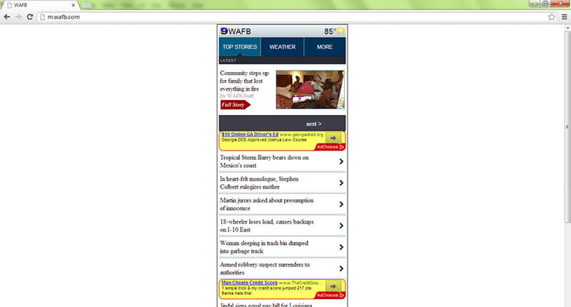
Example of a separate mobile site as viewed on a desktop.
One of the distinct advantages of using Mobile Responsive design is that the user is not sent to a separate mobile website.
Have you ever seen someone share a link from a 'mobile' site from their phone on Facebook? When you visit the link on your computer, you get a site that is "optimized for mobile" -- it technically still works, but it's weird (pictured right).
With a Mobile Responsive approach, you are not maintaining two separate websites, and users aren't getting different content.
How It Works
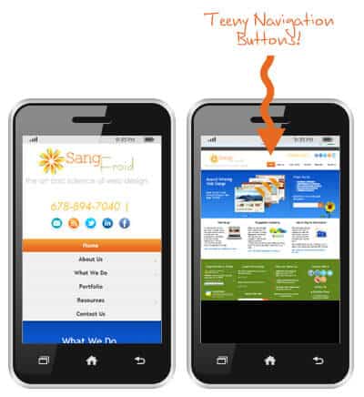
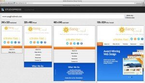
Example of a how a Mobile Responsive website looks on different devices.
Mobile Responsive sites adapt to visitors targeting four types of devices:
Old fashioned desktop computers
Laptops
Tablets
Phones
Visitors expect the same high-quality viewing experience from your website regardless of the screen they are using. Your site must load quickly, be graphically complete and, most importantly, be easy to navigate.
How People View Websites
Navigation on Mobile Responsive site vs. Non Mobile Responsive
Let's face it, searching on a desktop is vastly different than searching on a mobile device.
Where is the Navigation?
On a desktop, visual images are of utmost importance to capture your viewers' attention. Navigation tools can be secondary, because your viewer can take in visual images and still see a navigation bar across the top or bottom of the screen.
But on the small screen of a tablet or phone, navigation is paramount. Viewers do not respond well to cut-off images or to navigation bars that are hard to find or use.
Mobile Users Have Different Priorities
Consider the viewer who is planning her next vacation. She'll go to her desktop or laptop to view photos and videos of her potential destinations. That type of search isn't optimal on the small screen of a phone. But she may use her phone to look up resort availability and pricing.
The savvy web designer will make sure that those accessing their site from a desktop will see a slide show of big, beautiful photos while phone viewers will have immediate access to navigation tools.
What This Means for Web Design
In the past, web designers had two choices: either compromise quality on one or more device, or essentially design multiple websites.
Today, thanks to Mobile Responsive Web Design, we are able to design one site that automatically adjusts to the different devices that viewers use.
The folks at StudioPress describe Mobile Responsive Web Design this way:
"You are not building a web 'page' anymore, but rather a 'network of content' that can be arranged and displayed to show it off in the best way possible, no matter where it is being viewed."
What You Should Do
Test How Your Site Appears on Mobile Devices Using this Easy Tool
It's easy to determine whether your website is Mobile Responsive. Mobile responsive testing tools and websites like Am I Responsive allow you to plug in your web address and instantly view your site as it appears on the several different sizes of screens.
Check out your website, and also take a moment to look at other websites. It's instantly apparent who's Mobile Responsive and who's not!
Options for Converting to Mobile Responsive
It May Be Time for a Re-Design Anyway
If your site is not Mobile Responsive, it may be time for a redesign.
Full Custom Design is not the only way to get a Mobile Responsive website. If you are considering a less expensive template option, virtually all StudioPress templates are Mobile Responsive now.
Whether our clients choose a less-expensive Template route, or whether they want us to design a custom site from the ground up, we strongly recommend incorporating Mobile Responsive Design into all of the websites we create.
Convert Your Existing Site Design to Mobile Responsive
Converting a site to Mobile Responsive is not always as difficult as it might seem. If your site is built on the Genesis framework for WordPress (which most of our recent client's sites are), it's even easier.
Either way, it's important that you know where your website stands and that you put Mobile Responsiveness in your business plans as soon as you can.
Need help creating a Mobile Responsive website? We'd be happy to help. Feel free to Contact Us.
Liz Eisworth is the founder and lead designer of SangFroid Web located in Alpharetta, GA. As an experienced website designer and SEO strategist, Liz designs custom WordPress websites, optimizes websites for SEO, and leverages Local SEO / Google Business Profiles for business owners who are looking to improve their online presence to earn more traffic and leads. She built her first website for a business in 2003 and her first WordPress website in 2006. Learn more about Liz »


